ICHI
Digital
Rebrand
Full rebrand of ICHI's digital and social presence
As the resident digital expert at ICHI, when the time came to refresh the agency brand, the task fell to me to enact the digital portion of that transformation.
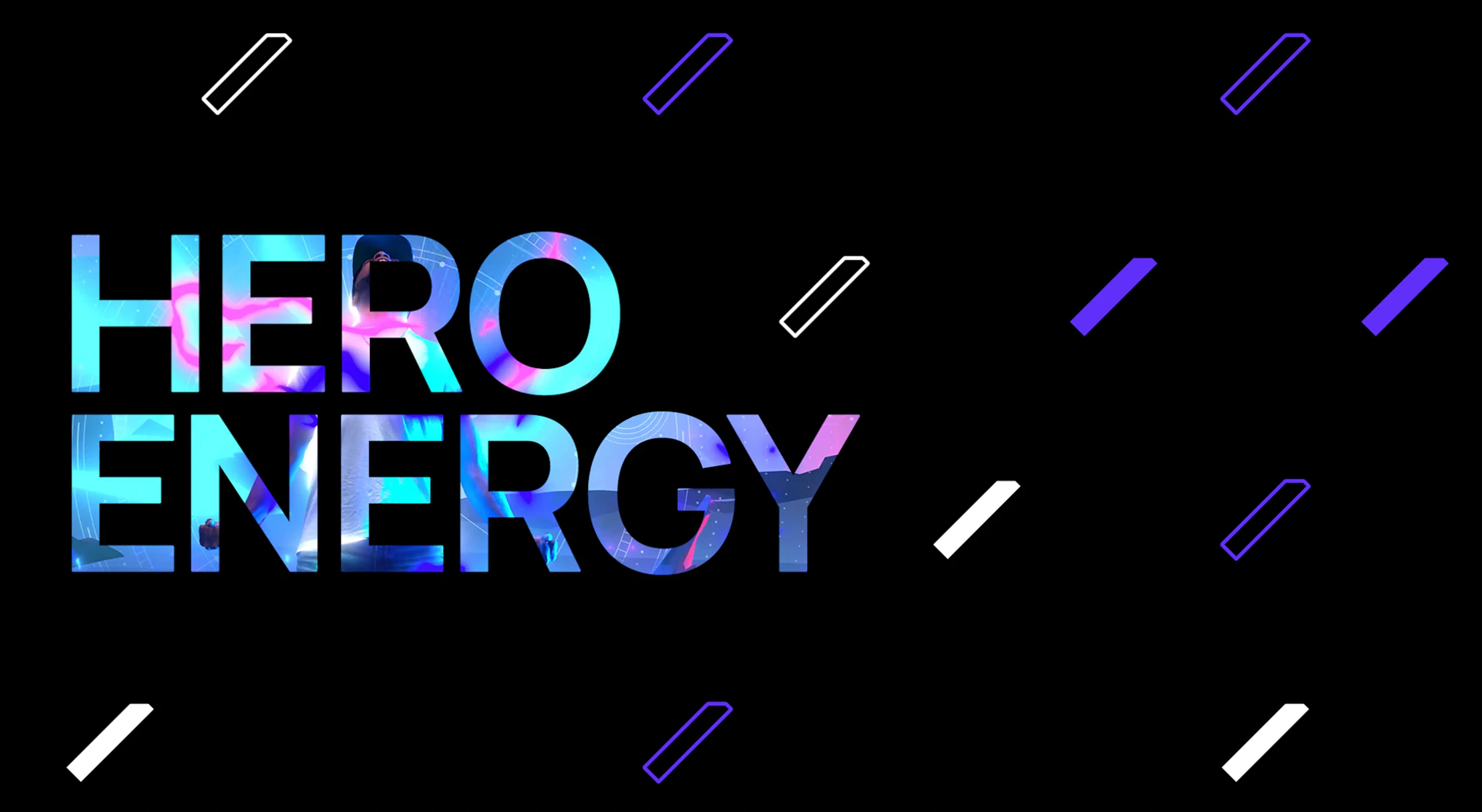
The brief was to bring ICHI's digital presence in line with the new brand identity and brand propostion of "Hero Energy".
Working closely with the design director, this meant redesigning the website from the ground up (including a new blog and agency news section), as well as developing and honing the brand identity and voice across digital and social.
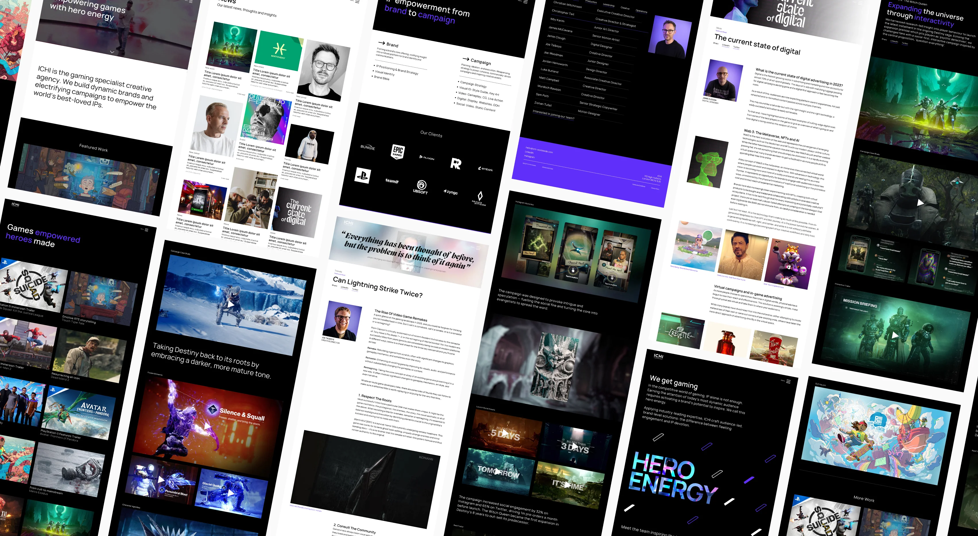
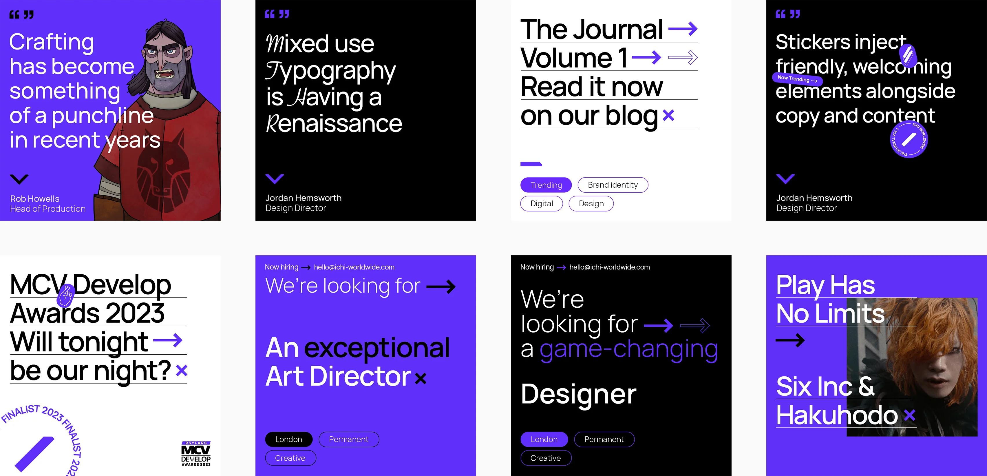
The Website
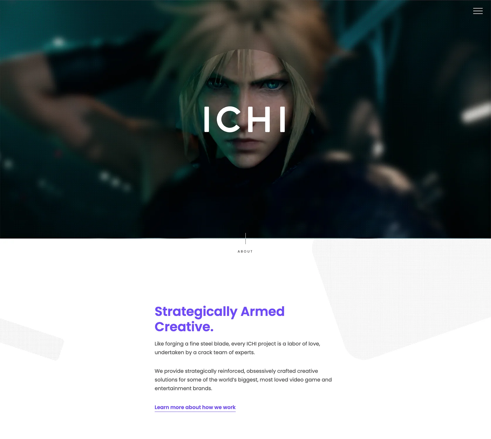
The existing website was looking very dated and cramped, not allowing the work to shine or show ICHI's capabilities to the fullest.
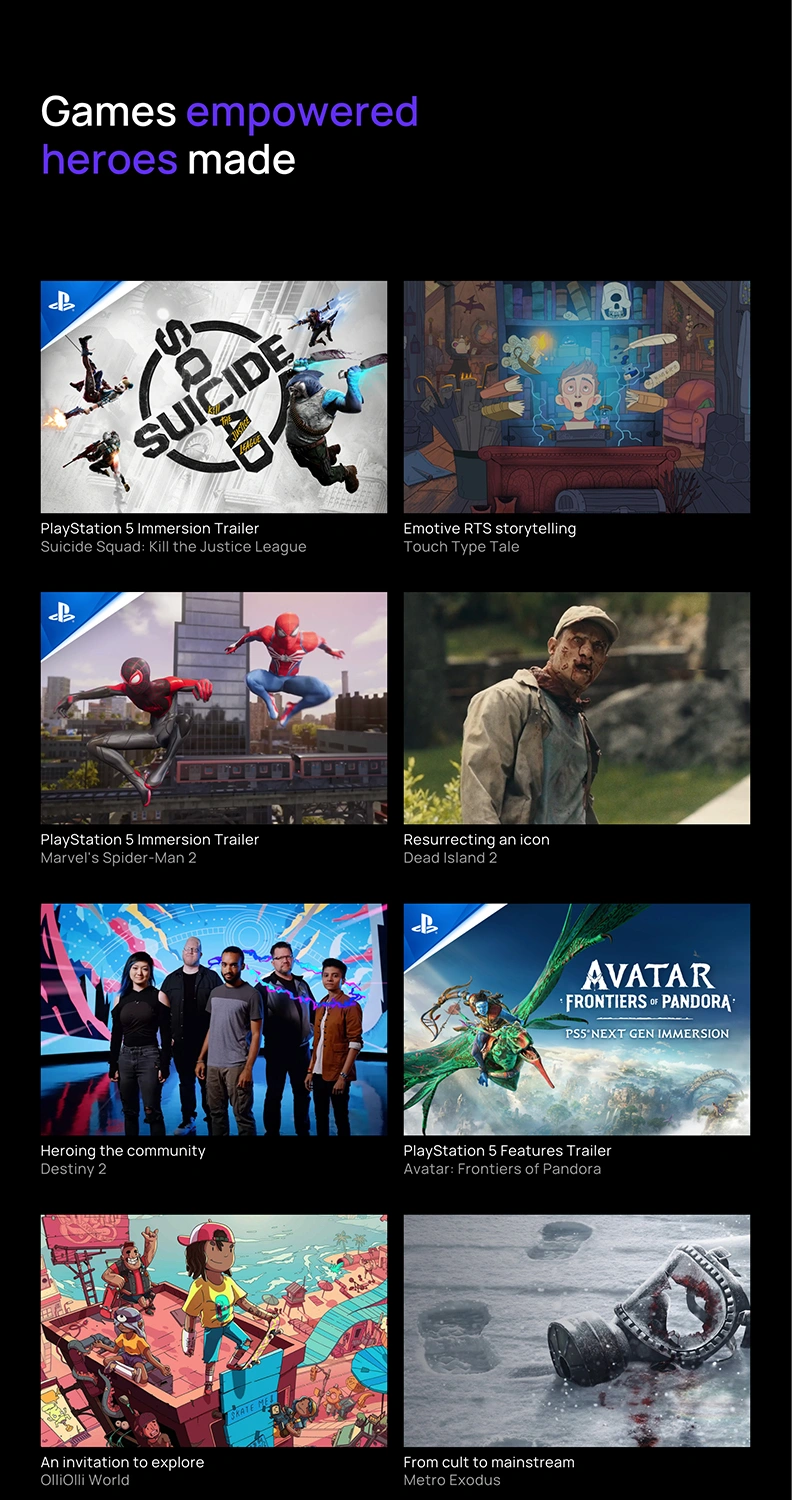
The new design needed to maximize the use of space to showcase the award-winning work and position ICHI as the leading agency in the world of gaming.
The key challenge was to create a design which struck the right balance between seriousness and personality.
We wanted a modern and minimal design to present ICHI as serious and forward thinking, with enough personality to convey the "Hero Energy" proposition but not so much that it felt too boutique.
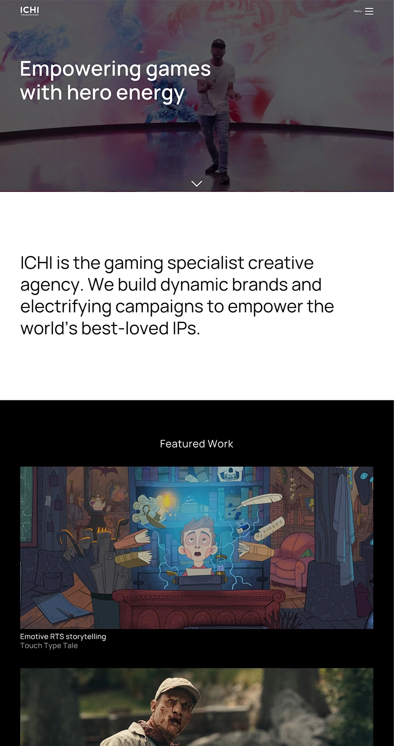
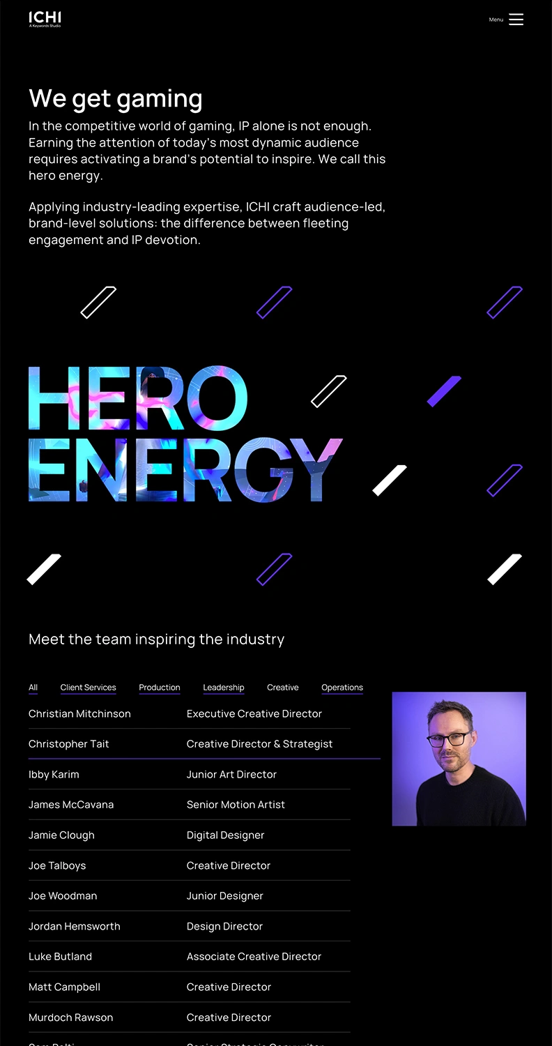
The end result was a clean and modern design that brought ICHI's work front and centre.
The minimal colour palette and carefully considered choice of a single font instilled the required sense of expertise and gravitas, with the sparing use of ICHI's signature purple brand colour serving to provide emphasis where needed and inject personality.
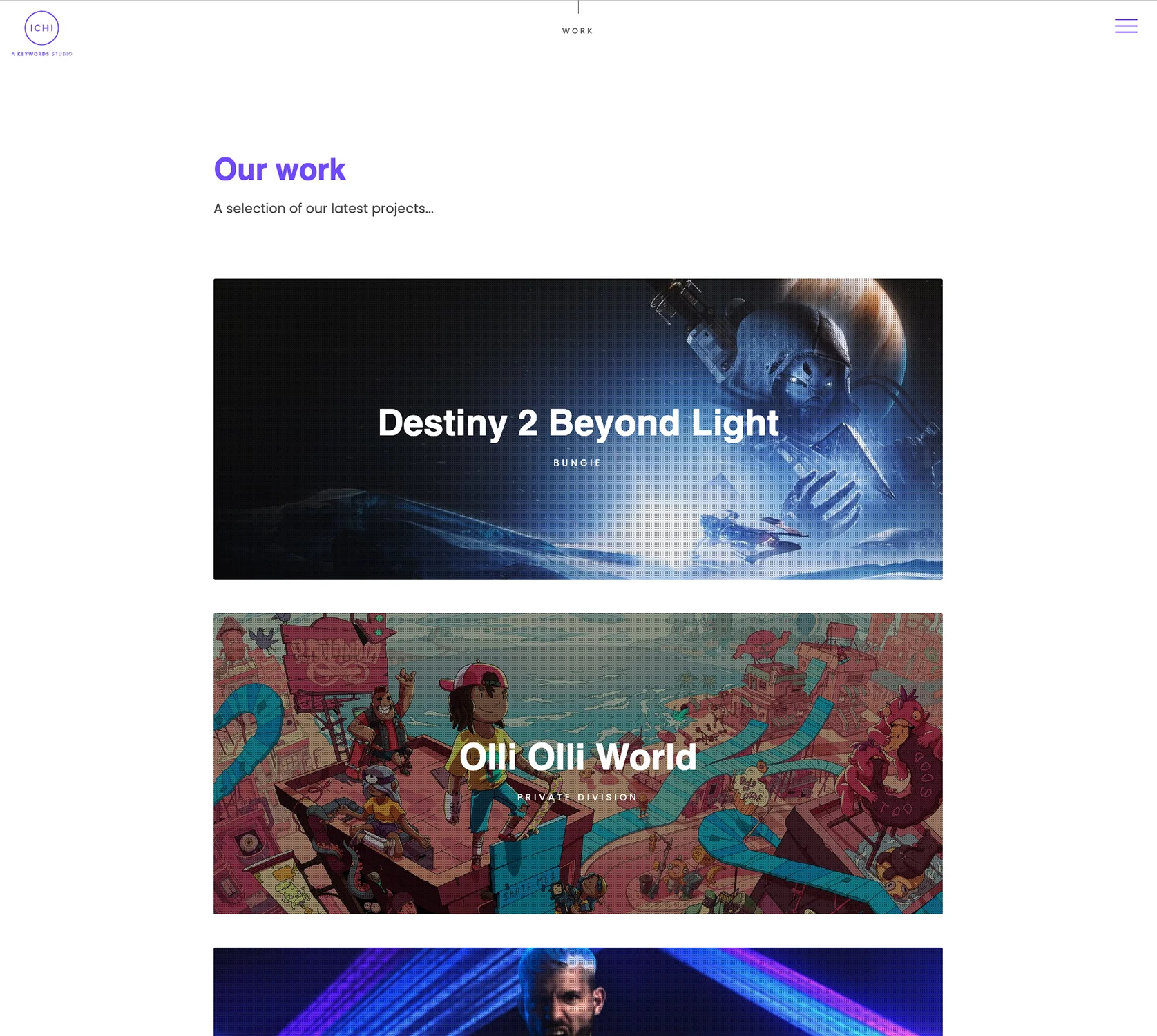
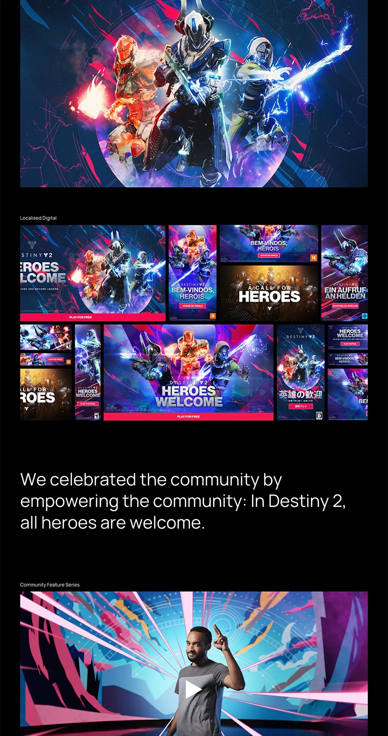
For the project section, a more storified approach was taken, presenting the approach to each brief and exploring the response instead of merely showing the result. A mix of flexible grid layouts and full-bleed images provided enough versatility to hero the important aspects of each case, letting the work speak for itself.
Overall, the new website marked a successful first step in ICHI's transformation to become a leading creative agency in the gaming sector.
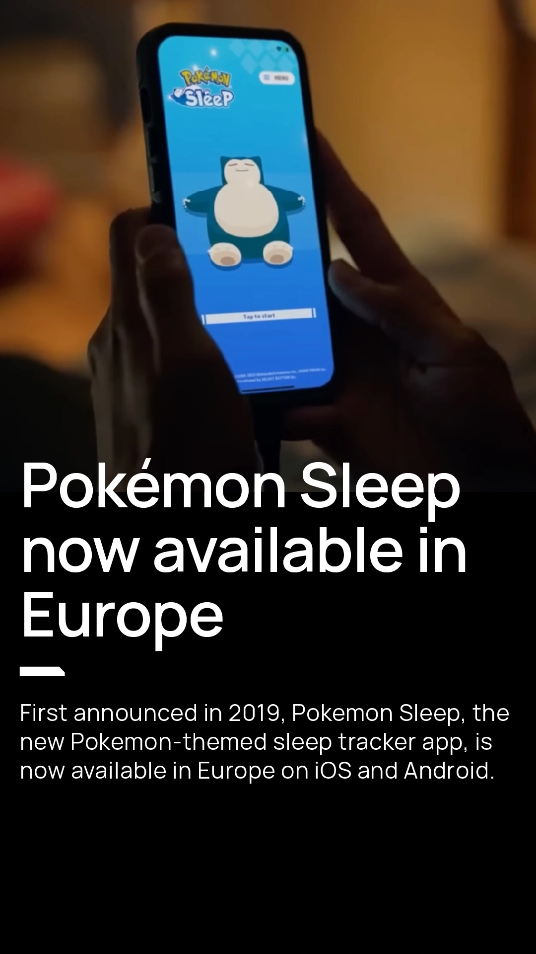
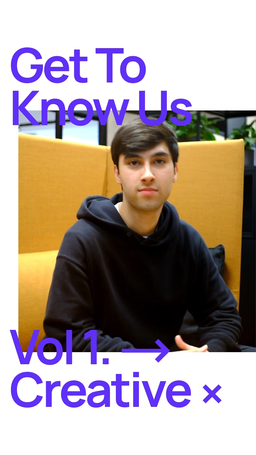
The Blog
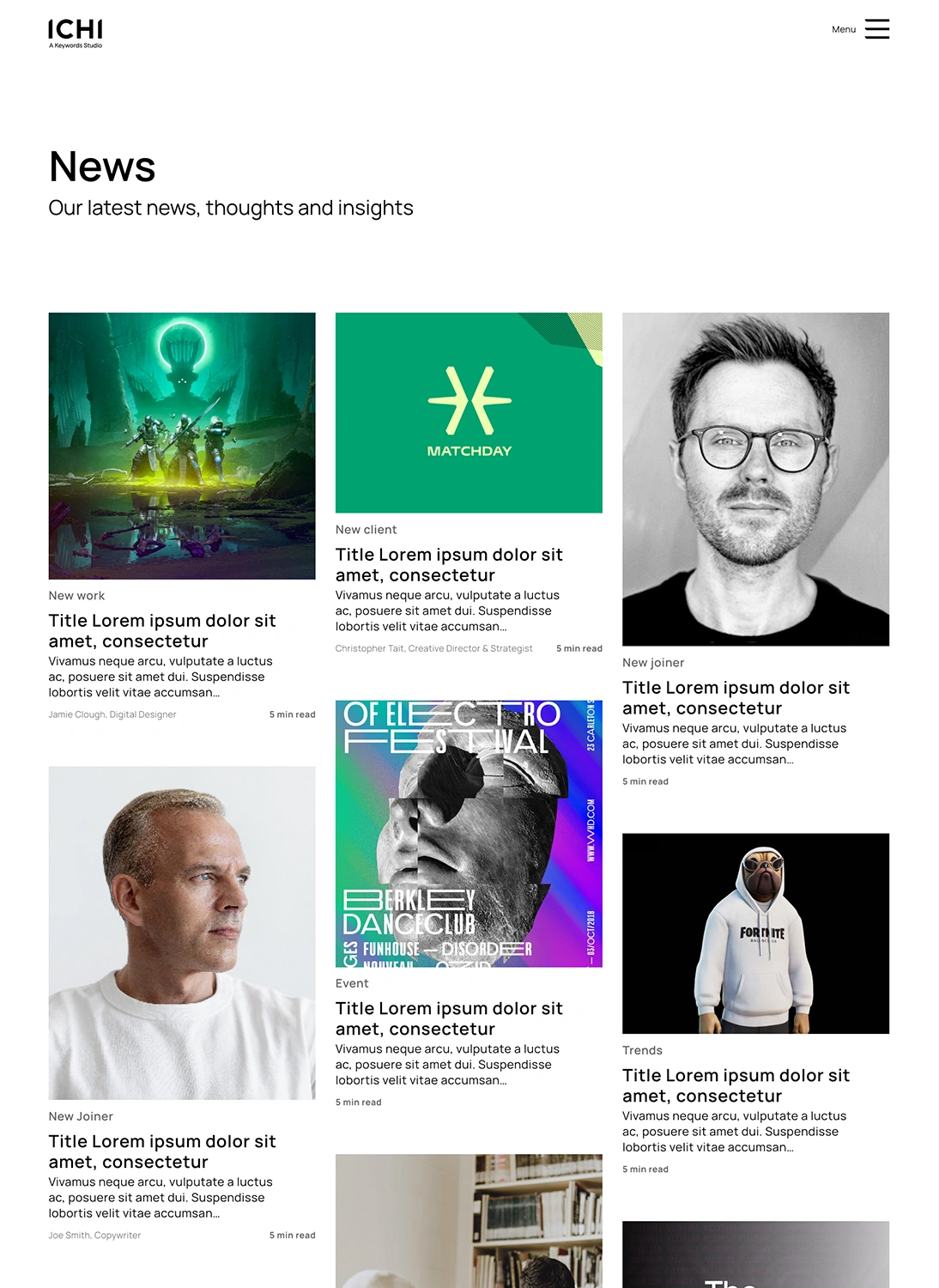
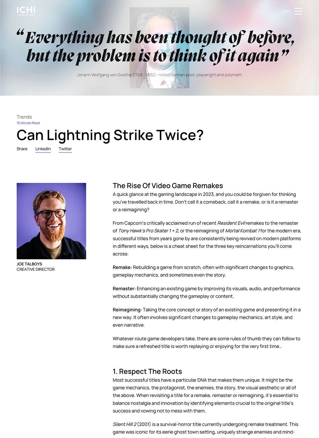
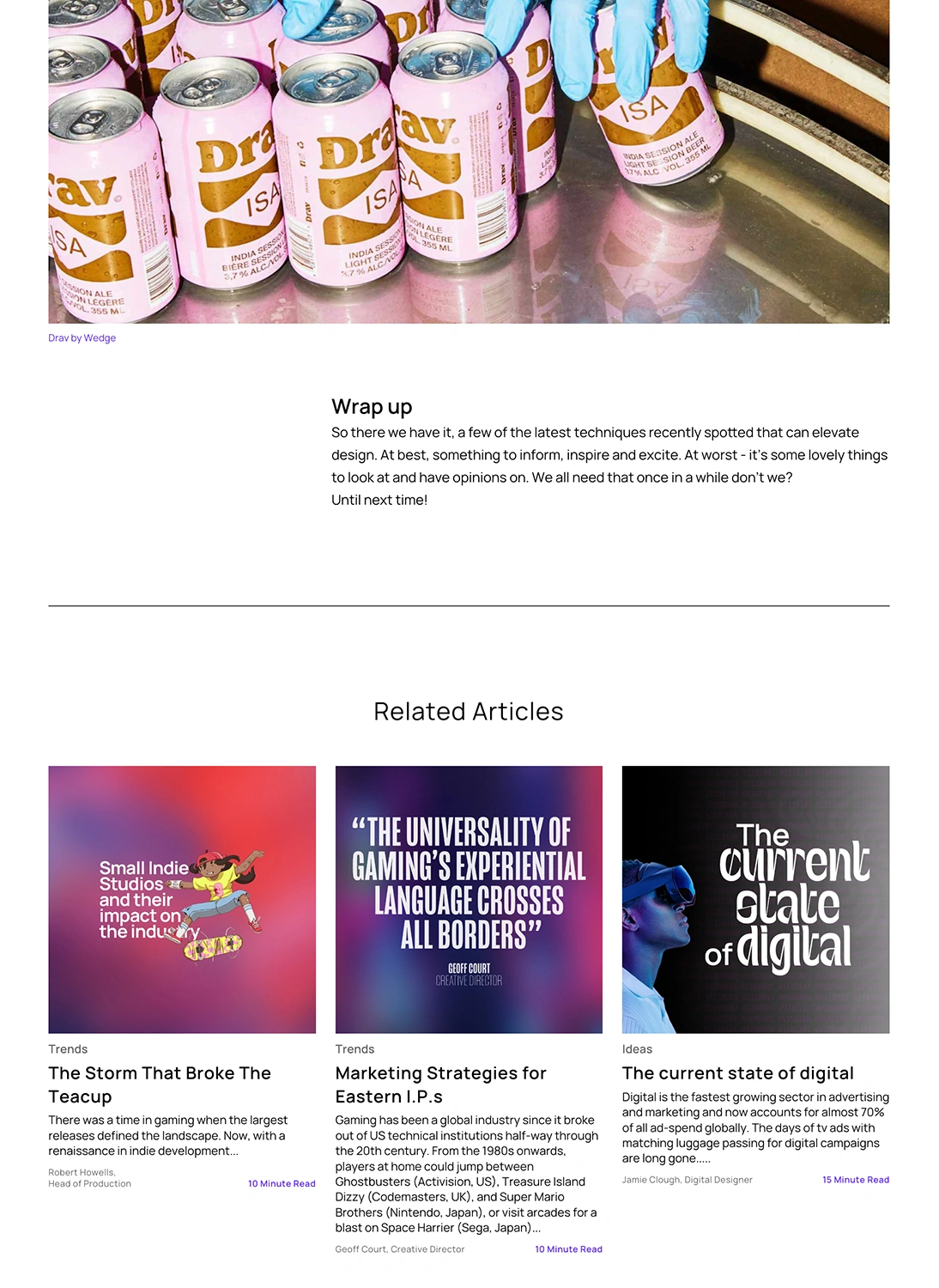
As a companion to the website we decided that ICHI needed a dedicated blog. This would be a place to share agency and industry news as well as thought pieces and long-form content.
The goal of the blog was to both showcase ICHI as a thought leader with its finger firmly on the pulse of the gaming and creative industries and also provide a place for the team behind the work to share their opinions and ideas and give an insight into what it's like to work at ICHI.
The blog needed to have a visual identity that was distinct from the main site whilst retaining the same design language. As with the main site, it needed to show a balance of expertise and behind the scenes personality.
The result was a lighter design with a more journalistic feel and a modular approach that allowed for flexibility and versatility of content.
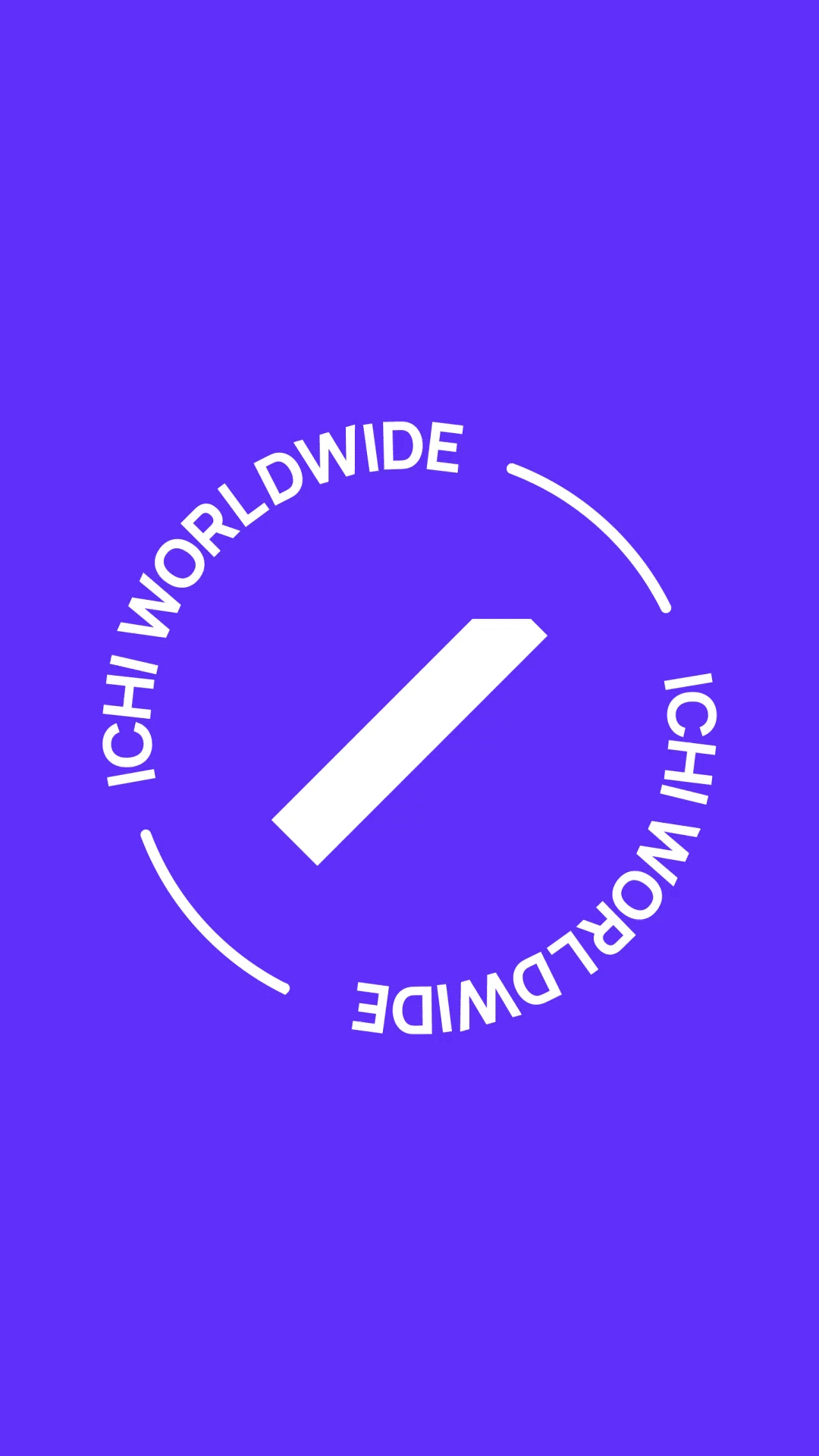
Social
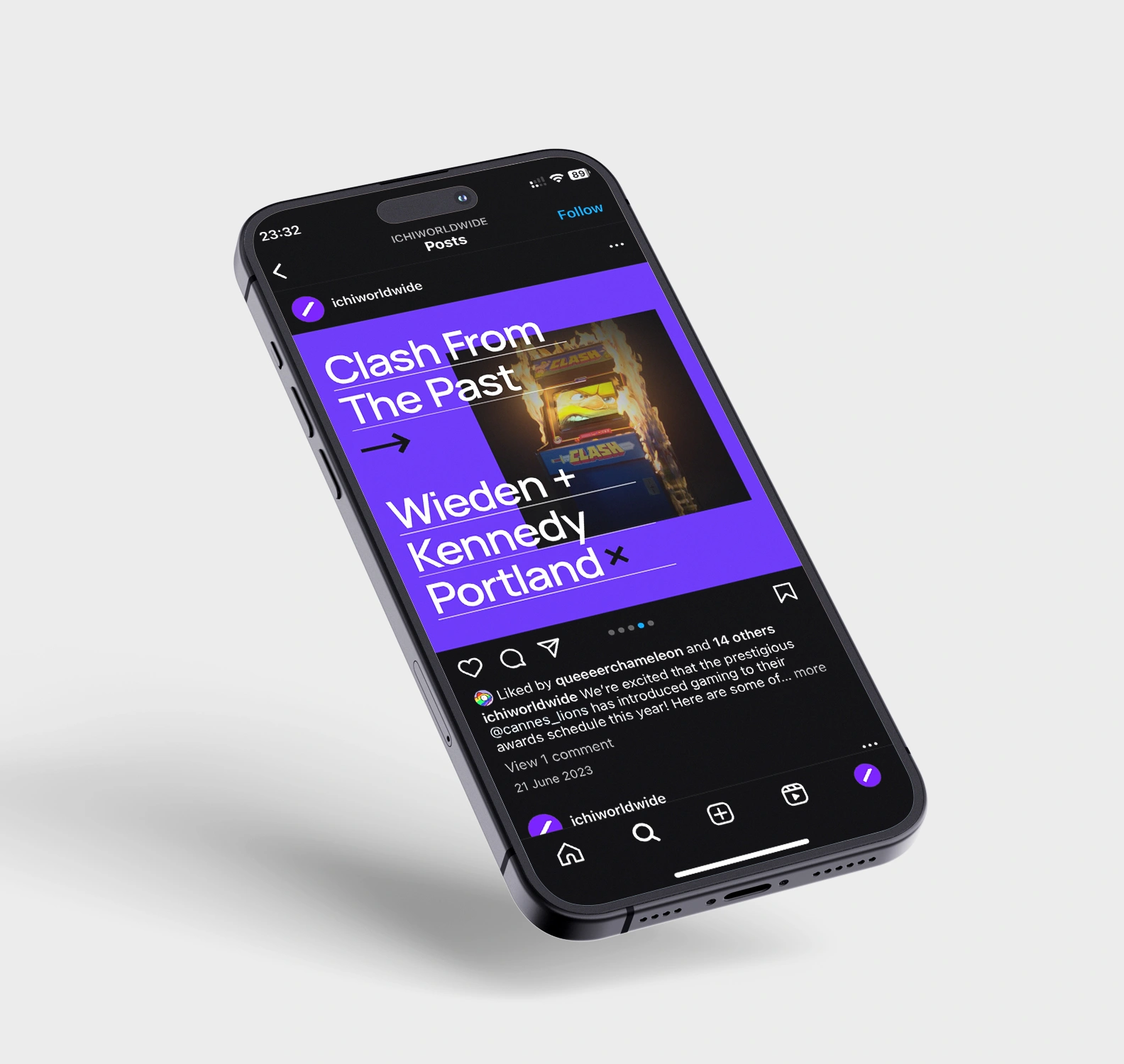
To complete the digital rebrand of the agency, a new visual identity for social channels was also necessary.
Building on the design language of the website, the social identity enabled more experimentation and evolution within the existing design system.
This took the form of an iterative adaptive approach, using live feedback and engagement to help steer the creative and ultimately discover the optimum design and tone for each format and post category.
The ultimate goal of the social rebrand was to create a social presence that could give a deeper insight into ICHI's agency culture, with the aim of attracting new talent and new business alike.
Once the building blocks of the social brand were in place, we could begin pushing the designs further, experimenting with layouts and typography to find the perfect balance point where creative expression and brand consistency met.
As confidence in the direction of the design system grew, this experimentation broadened to include motion.
We began by creating a library of animated brand elements and animated transitions, gradually developing a set of motion guidelines for our social content.